/ 6 min read
ThunderBashers: rebuilding the look without breaking the game
How the post-jam overhaul went out as version 1.1 on Wavedash: staged by visibility, guarded by flags, judged in the engine.
ThunderBashers shipped in five days with hand-drawn robots, a grid for a floor, a star field for a sky, and a UI assembled from code. The spin mechanic worked and the bots had temperaments. It looked like a jam game, because it was one. In September I gave it a full visual and feel overhaul and published it as version 1.1 on Wavedash. Two rules held for the whole thing: the shipped build had to stay playable at every commit, and every stage had to be judged in the engine, not in a mock-up.
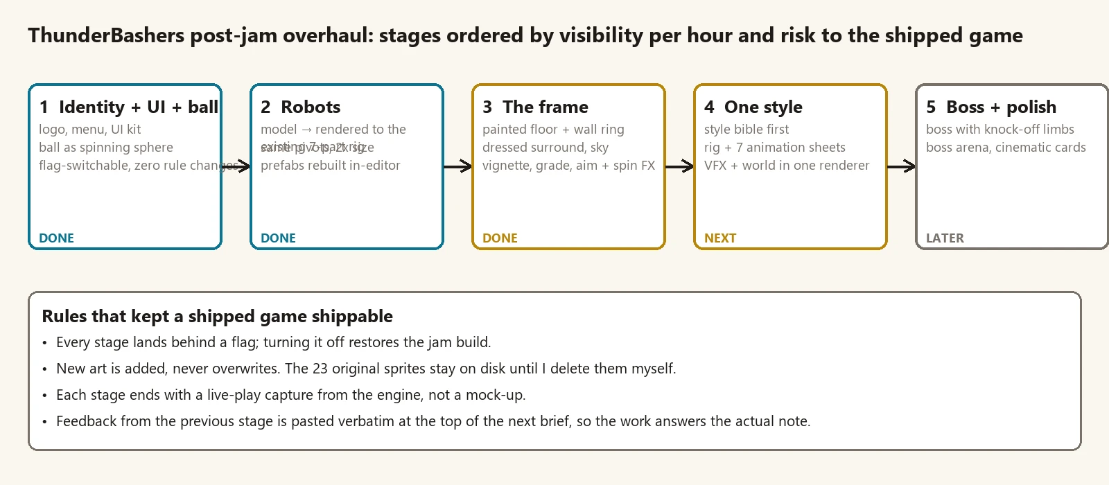
Order by visibility per hour
The first question was what to touch first. I ranked candidates by how much a player would notice per hour of work, weighed against how much gameplay code each one put at risk.
Identity won. A logo, a menu, a UI kit, and a ball that reads as a storm sphere change the first thirty seconds of the game and touch almost no rules. Robots came second because they are what you look at while you play. The arena frame was third, since it is the backdrop for everything else. Animation and VFX went last on purpose. They depend on the final robot and the final palette, and tuning them against placeholders would have meant doing them twice.
Stage 1: the game gets a name
The tone already existed in the jam copy: “VERY SERIOUS Robot Combat League,” deadpan broadcast graphics for a sport that is robots hitting a lightning ball. The logo had to carry that joke. I ran three directions, a wordmark with a spinning-blade monogram, a league crest, and a broadcast lockup with a LIVE tag and a tagline bar, and judged them at 200 pixels on light and dark backgrounds. The broadcast lockup won. The crest became the app icon.
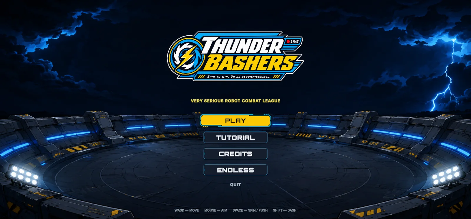
The first UI kit was clean and forgettable: rounded rectangles, one accent colour. The second pass borrowed the logo’s language, chamfered corners, diagonal speed lines, hazard stripes, LIVE red for danger states. Same nine-slice borders and pixel sizes, different personality. Every piece sits behind one flag, and turning the flag off gives you the jam build back.
Stage 2: new models, same rig
The jam robot was seven sprites: body, head, two arms, three wheel views, assembled by an editor script with fixed pivots. I did not want to rewrite that. So the new robot was built as a low-poly model and rendered from the game’s own camera angle into the same seven parts at twice the pixel size, with a validation script checking every pivot against what the engine generated. The prefabs went through the existing builder, and the assembled robot’s bounds landed within three percent of the original.
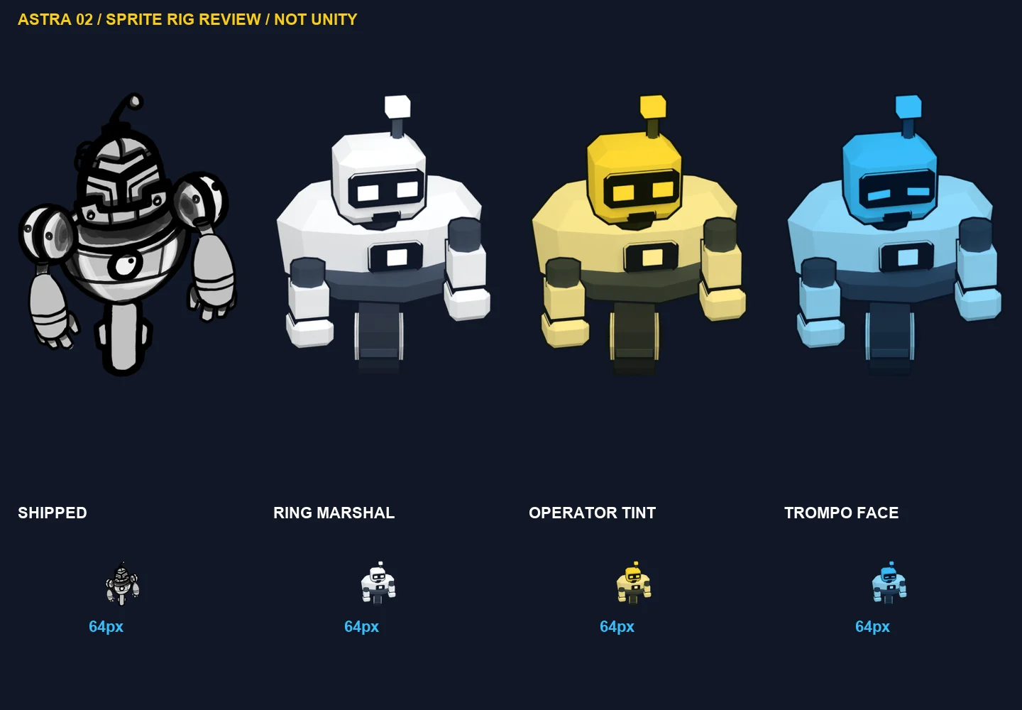
Honest verdict on that stage: technically perfect, artistically a step sideways. The hand-drawn jam robot, with its bulb antenna and one eye, had more personality than the clean model. The pipeline was right and the brief was too loose. I kept the pipeline and sent the character back for a personality pass, which gave it the slightly foolish expression it has now.
Stage 3: the frame is one picture
Play-testing the stage 2 build produced the note that mattered most: the aim arrow was awkward, the spin ring felt like a shrinking outline rather than a charge, and the backgrounds were horrible. The floor was a grid, past the rim was nothing, the sky was stars. No amount of robot work fixes a scene with no ground.
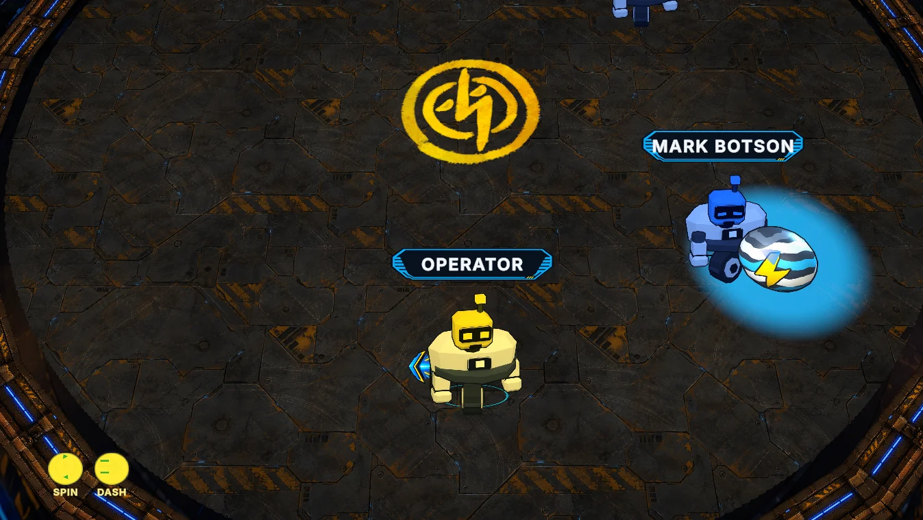
Stage 3 treated the whole frame as one image: a floor per arena, a wall ring with depth, stadium seating and floodlight rigs behind the walls, storm skies, a vignette I can dial with one number, a chunky aim chevron, and a twelve-frame spin ring that pulls inward on the existing windup timing. Loading screens with league tips, round cards, and danger alerts landed in the same stage because they share the language.
The style seam
Looking at that frame I could see the next problem. The floor and skies were painterly. The robots were flat-shaded with ink outlines. Each was fine alone. Together they read as two games. So stage 4 started with a written style bible and one rule: everything in the match frame is rendered the same way. Flat three-tone shading, one ink weight, one lighting rig, and the stadium rebuilt as low-poly geometry in the robots’ style. Painterly work moved to loading screens and marketing, where it belongs.
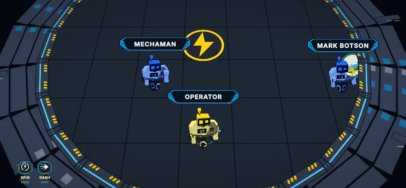
Closing the seam opened the next note: unified and empty. So the dressing pass put wear, silhouettes behind the rails, and light falloff back inside the flat language, and gave each of the seven arenas its own venue.
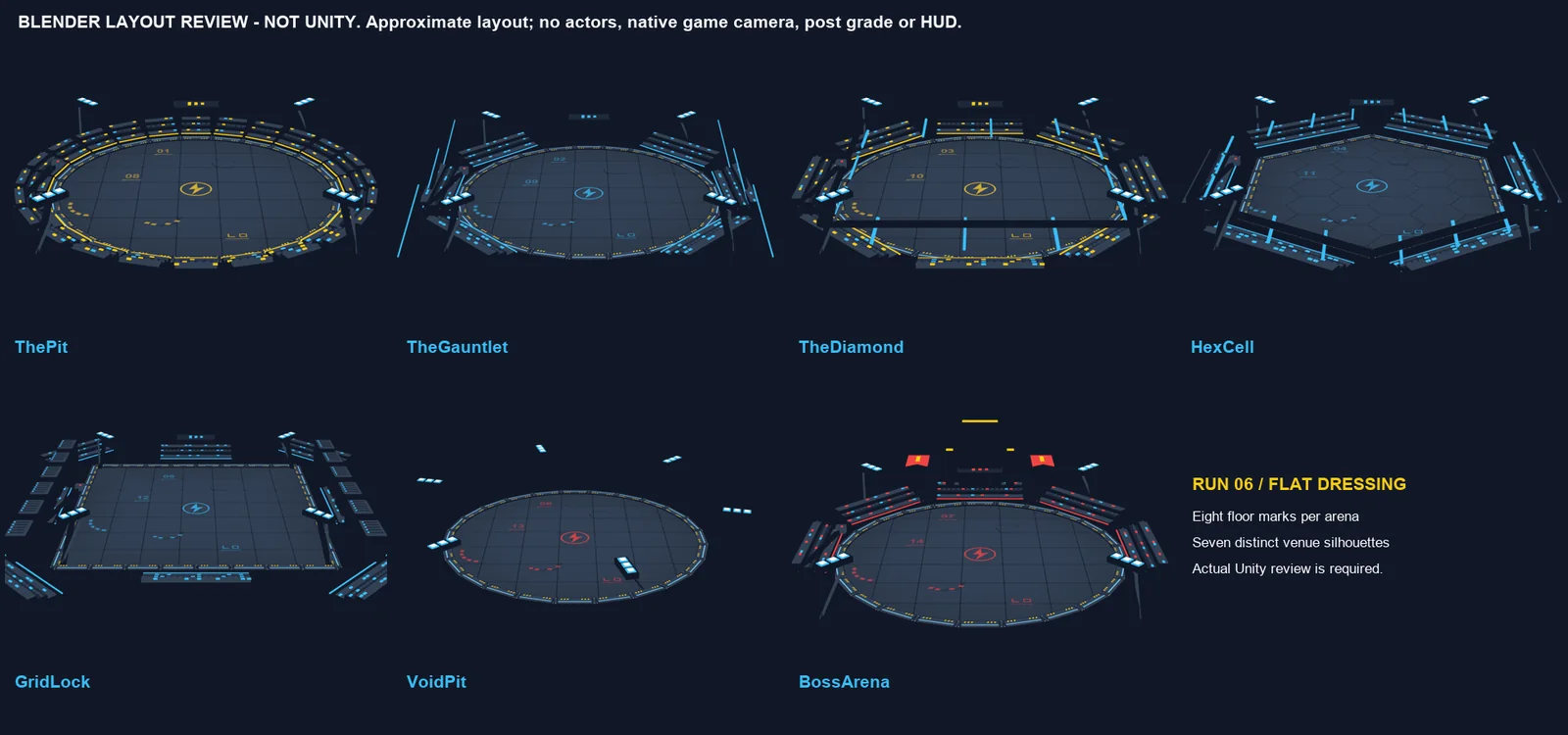
The part you can hear and feel
Once the frame held still, the last stages were about the hit. A strike now has hit-stop on a curve, an impact flash, punch-zoom, shake, a vignette pulse, and a pitch dip in the audio, all driven by one feel profile I can tune in the inspector. The metallic ball hits came back from the jam’s sound library as a base layer, with procedural transients on top so no two hits sound the same. Forty-four procedural sound effects, a mixer with music, SFX, and UI buses tied to the settings screen, gamepad bindings with glyph hints, and an announcer who calls countdowns, streaks, and the champion finished it.
What I’d keep
Stage by visibility per hour, and put animation last. Guard every stage with a flag so the shipped game never stops being shippable. Judge in the engine with the real camera and light, because renders and mock-ups lie about scale and glow. And paste the previous play-test note verbatim at the top of the next brief, so the work answers the actual complaint and not a paraphrase of it.
Version 1.1 went live on Wavedash on September 7. The online update followed it: a Garage for naming and decorating your robot, and rooms with host-authoritative netcode over the Wavedash SDK. That one was built on the same rule, the offline simulation untouched underneath, with the network layer sitting beside it instead of inside it.